
Notre Raglan réversible a reçu beaucoup d'attention depuis que nous l'avons présenté au monde. Beaucoup d'entre vous ont sauté sur l'occasion de créer votre propre design pour vos équipes scolaires, de club et de ligue ! Bien que nous aimions l'enthousiasme de la communauté, nous voulons nous assurer que vous aimez également vos maillots – et ce produit nécessite quelques considérations spéciales à l'étape de conception.
Créer de l'art pour un excellent maillot réversible peut être difficile, alors nous sommes ici pour partager quelques conseils appris en cours de route. Prenez un stylo et un carnet, et mettons-nous au travail !
CONSEILS DE CONCEPTION POUR TANK REVERSIBLE ET JERSEY REVERSIBLE
UN SOMBRE/SOMBRES OU UN SOMBRE/CLAIR
Tout tissu sublimé est à l'origine blanc des deux côtés – retournez l'une de vos maillots sublimés pour voir ce que nous voulons dire. Voyez comment le revers de votre maillot est principalement blanc, mais vous pouvez encore voir le design (ou des parties du design) qui transparaît légèrement ? Nous appelons cela transparence, et c'est le détail le plus important à garder à l'esprit lors de la conception d'un vêtement réversible : les éléments artistiques d'un côté apparaîtront de l'autre.
Nous avons testé plusieurs solutions possibles pour minimiser le passage de couleur : correspondance des couleurs, miroir artistique, correspondance des nuances... et le seul moyen de réussir est de concevoir soit deux côtés sombres, soit un côté sombre et un côté clair. Les couleurs blanches et/ou très claires ne sont pas disponibles en raison du passage de couleur.
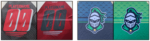
PATRONS À LA RESCOUSSE
Les motifs de fond sont vos meilleurs amis ! Ils sont excellents pour détourner l'œil des transparences.
ROUE DES COULEURS POUR LA VICTOIRE
Les couleurs contrastées s'annuleront, il est donc préférable de garder les couleurs dans une famille similaire. Nous vous suggérons d'utiliser la roue des couleurs ci-dessous pour vous aider à sélectionner des couleurs pour vos chiffres, motifs ou logos.
 Conseils:
- Choisissez des couleurs d'une famille similaire ou du même côté de la roue des couleurs. Cela garantira qu'elles se complètent.
- Le transfert changera de couleurs ! Toute couleur utilisée sur le côté Clair apparaîtra plus foncée en raison du transfert du côté Sombre. Voir notre exemple ci-dessous, et n'oubliez pas la théorie de l'addition des couleurs : le bleu et le rouge peuvent donner du violet ; le bleu et le jaune donneront du vert.
- Attention au fort contraste entre les couleurs claires et foncées – plus les couleurs d'un côté sont foncées, plus les couleurs de l'autre côté devront être foncées/plus saturées.

Couleur inchangée sur fond BLANC (ligne du bas) et la même couleur sur fond NOIR (ligne du haut). Les couleurs Pantone utilisées sont notées en bas.
LES COULEURS BLANCHES ET CLAIRES NE FONCTIONNERONT PAS
Ici, les couleurs de lumière blanche ne sont pas recommandées - le passage est trop fort. Notez comment le blanc et le jaune sont affectés par toute autre couleur pressée à l'envers, tandis que les bleus vifs ne montrent qu'une légère variation de ton. La couleur non altérée (soutenue par du blanc) est montrée à l'extrême droite.

POSITION DES ÉLÉMENTS DE CONCEPTION
La façon la plus simple d'éviter une forte transparence est de faire un miroir de l'art entre les deux côtés, comme montré ici :
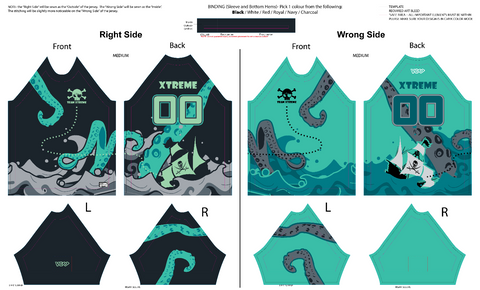
Nous recommandons également de positionner les éléments plus petits (logos de sponsors ou de manches) de manière à ce qu'ils soient décalés / non directement dos à dos. Cela inclut tout ce qui doit être clair ou qui contient du texte. Par exemple, un logo de manche sera placé plus haut sur le côté A et plus bas sur le côté B ; ou un logo au dos pourrait être positionné en bas à gauche des deux côtés.
NOMS ET NUMÉROS
La partie la plus importante du maillot en termes de lisibilité ! Optez pour des polices larges et en bloc, et évitez les polices fines ou très étroites. Des caractères épais et gras seront beaucoup plus faciles à lire.
Remarque : En raison des couleurs globales plus sombres requises et de la transparence inévitable des chiffres, il n'est pas possible de répondre aux exigences de contraste pour la compétition d'Ultimate Canada, USAU ou WFDF.
COUTURES CONTRASTÉES
Les vêtements réversibles sont finis avec une pièce de biais séparée au bas du jersey et aux ourlets des manches. La couleur du biais est limitée à nos couleurs de tissu en stock (noir, blanc, rouge, royal, marine, charbon), mais c'est un excellent moyen d'ajouter une couleur contrastante ! Il en va de même pour les coutures : sur les jerseys, les coutures des épaules sont exposées. Et en raison de la construction du vêtement, seule une face du col sera visible une fois cousue.
Votre maillot est-il noir avec des chiffres rouges ? Choisissez des finitions, des coutures et un col rouges pour une touche de couleur supplémentaire, ou optez pour le noir pour un look élégant et subtil. L'important est de choisir une couleur qui s'harmonise avec le design des deux côtés.
PLANIFIEZ À L'AVANCE, ET PRENEZ LE TEMPS DE BIEN FAIRE LES CHOSES
Ne précipitez pas le processus ! Si vous n'êtes pas sûr qu'une combinaison de couleurs particulière fonctionnera, n'hésitez pas à nous contacter - nous sommes là pour vous aider ! Et ne vous découragez pas par toutes les restrictions impliquées, cela en vaut la peine lorsque vous obtenez un excellent produit.
Il est préférable de commencer le processus tôt ! Si vous avez une idée en tête, envoyez-nous un e-mail, remplissez notre formulaire d'intérêt ou soumettez un formulaire de demande/revue de design.
SUCCÈS!
C'est tout ! Si vous prenez ces conseils en considération, nous garantissons que vous adorerez le produit final. Bien que le maillot Reversible Raglan puisse nécessiter un peu plus de temps et d'attention pendant le processus de conception, le produit résultant aura fière allure, vous coûtera moins qu'un kit complet et réduira même notre empreinte environnementale en utilisant moins de tissu – c'est un triple gagnant !
Si vous souhaitez commencer à concevoir votre prochaine commande d'équipe réversible, parlons-en. Si vous avez des questions sur les tailles ou le délai de livraison, visitez la page produit Raglan Réversible.